
ION is ready for the future
28/10/2026
Davy Demuynck and Kristof Vanfleteren become the sole owners of ION and give the company a renewed brand identity.
We thank Paul for his support since ION was founded. His experience helped us grow the company into the innovative player it is today. Now that we are ready to expand our activities further, the time has come to continue fully independently, the two of us, as operational directors and partners.


Since it was founded in 2011, ION has built a portfolio of 157 projects and delivered 455,500 m² of real estate. The company opened offices in Brussels and Antwerp and moved into a new headquarters in Waregem in 2019. In 2025, ION won a MIPIM Award in the Best New Development category with The Hive in Amsterdam. Today, ION has 86 ongoing projects, totalling 1,051,000 m² and a market value of €3.2 billion. With a strong team and a solid financial foundation, the company is ready for the future.


An identity that fits who ION is
At the end of 2025, ION began a process with the renowned agency Base Design to renew its brand strategy and visual identity. The previous house style dated from 2014 and reflected the young developer ION was at the time. Since then, ION has grown into a versatile real estate player. Its projects have evolved too, each with its own character and appeal, but without a clear visual common thread linking them to ION as the central brand.
Through in-depth interviews with internal and external stakeholders, and workshops with a core group of employees, ION defined what it stands for today. The result is a sharpened positioning, a clear brand story and a recognisable brand system that respects the individuality of each project while strengthening the link with ION as the parent brand.
The starting point remained the same: context first, then real estate. Every location calls for its own answer: the right product, at the right time, in the right place. The aim was therefore not to reinvent ION, but to bring its identity closer to the way the company thinks and works today. With an entrepreneurial team that spots opportunities, takes initiative and turns ambitions into reality.
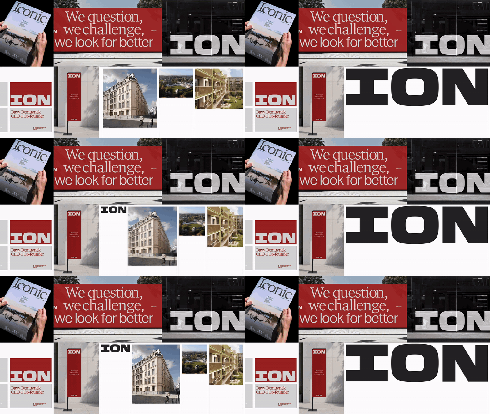
The result is an evolution, not a revolution. ION stays ION. And ION stays red. The new visual identity deliberately plays with contrasts: a powerful, almost brutalist logo set against refined typography. That combination reflects the different sides of ION: bold and considered, outspoken and understated. The deeper red gives the brand more maturity, while the logo works as a recognisable signature, from business card to site hoarding.
A strong brand has to do more than look good. Above all, it has to work in the real world. The new identity starts from ION’s DNA. We held up a mirror to ourselves: what ION has always done, we now translate into a language that fits who we are today.

A leap as a statement
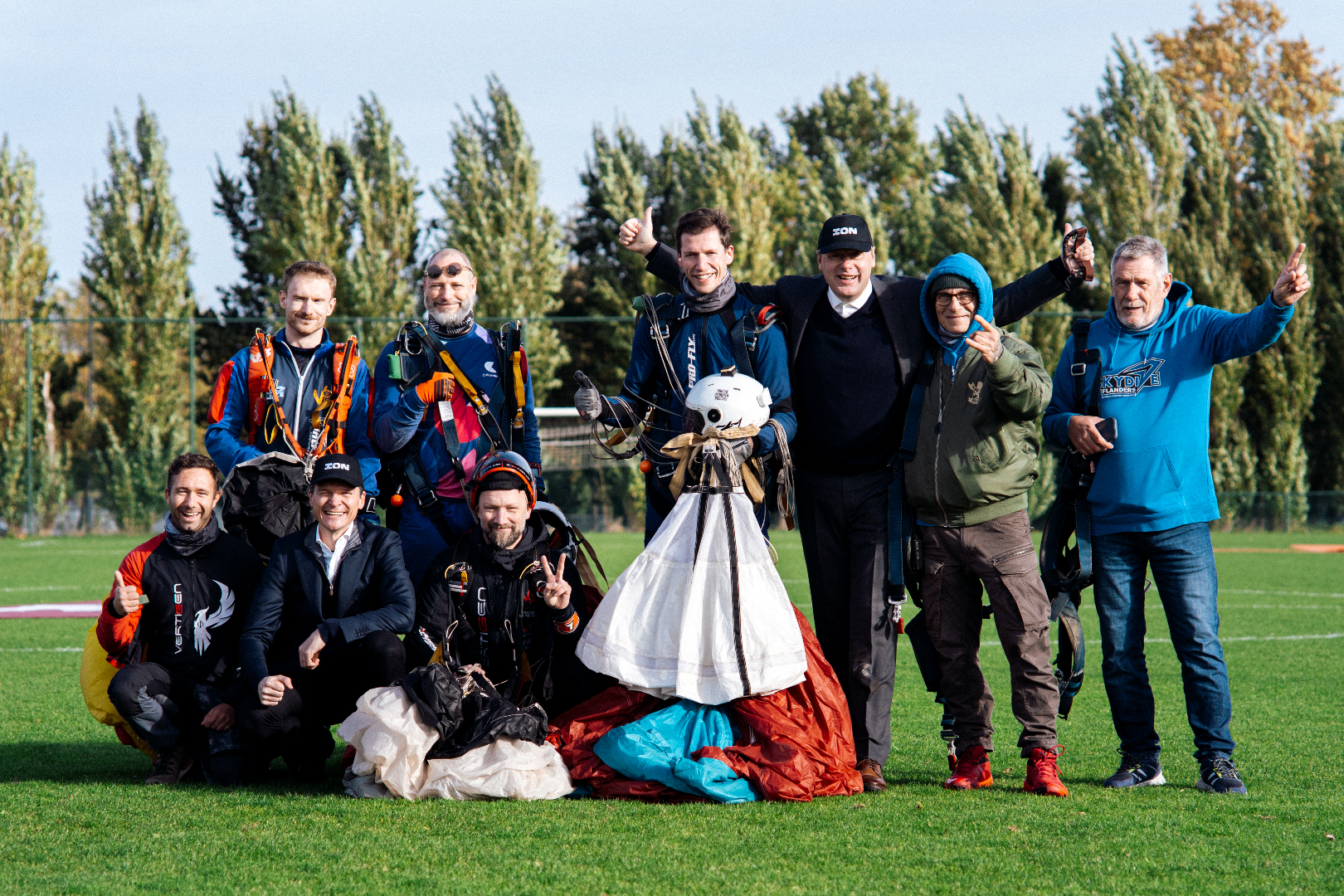
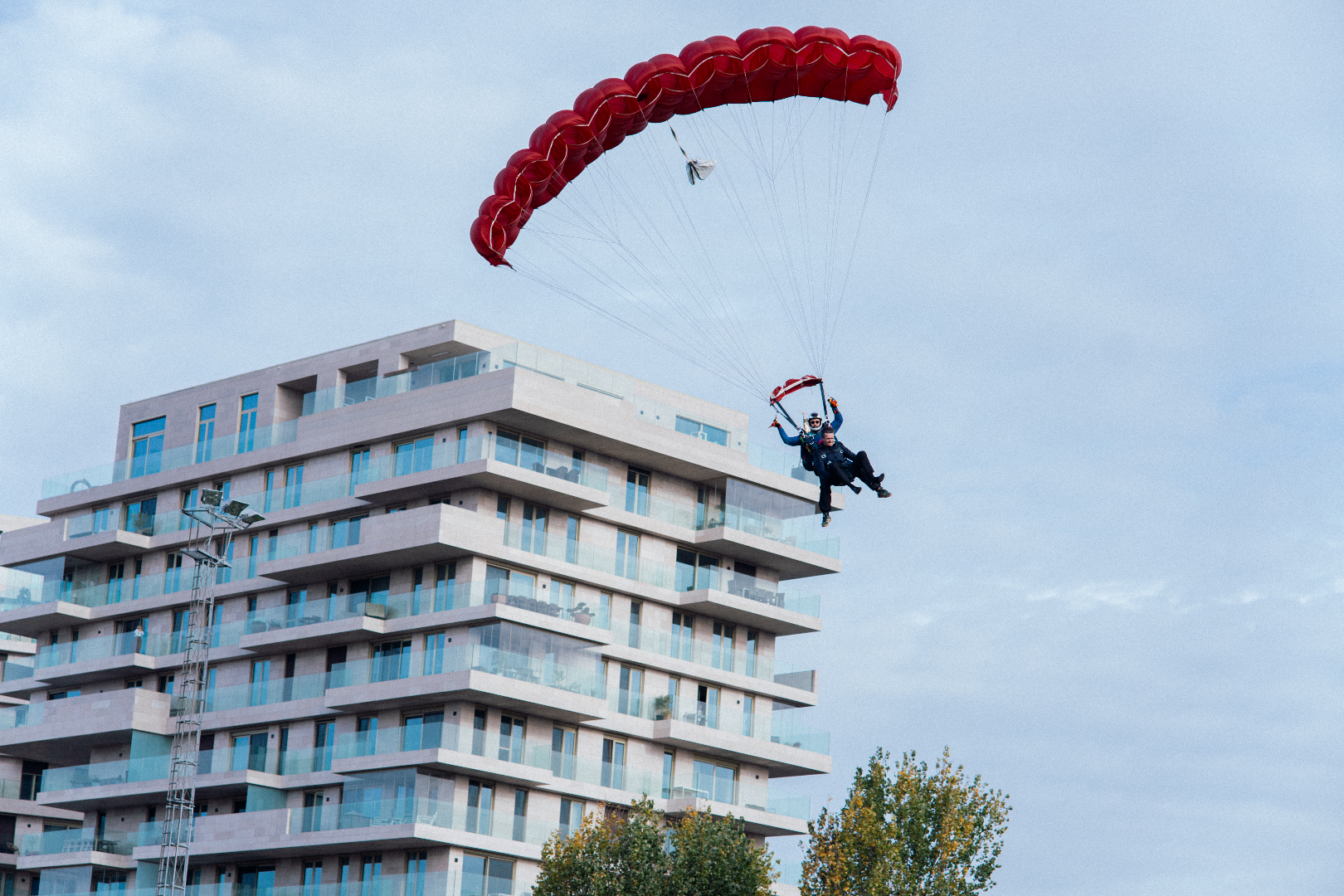
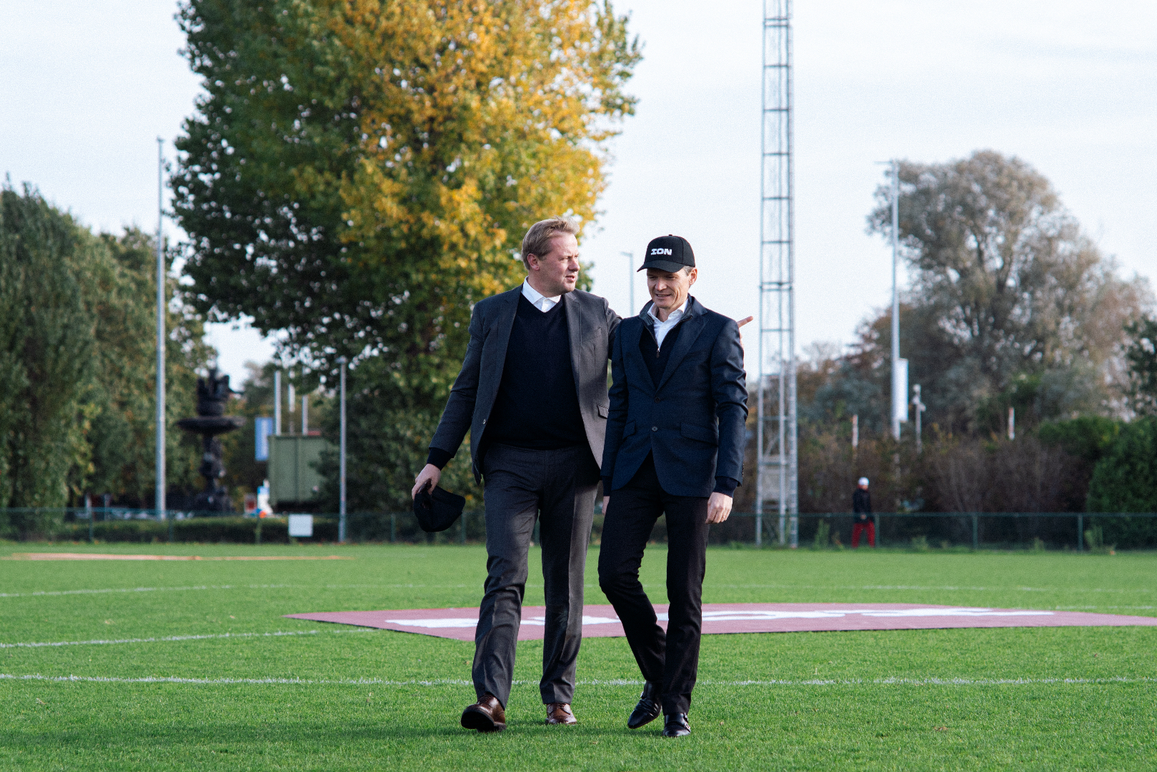
To announce the new identity, Davy and Kristof chose an approach that suits ION’s culture: Drive high, tempo fast, focus sharp. On Monday 26 October 2026, they jumped out of a plane at an altitude of 4,500 metres. During free fall, they reached a speed of 200 km/h. They landed close to Waterfront in Waregem. The stunt video premiered for all employees on 28 October at Back on Track and can be viewed below.
The brand system in pictures
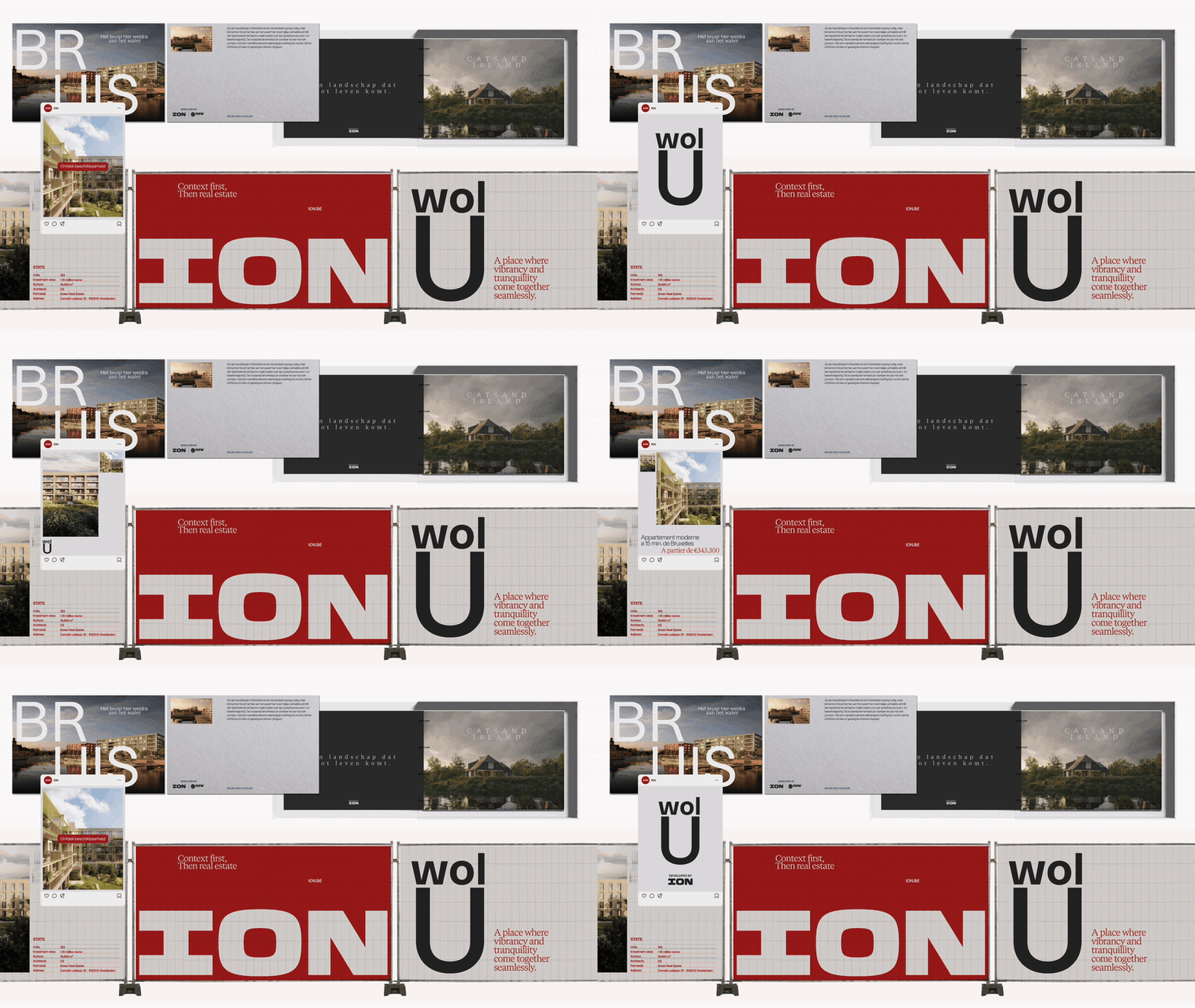
The new identity works on two levels. For ION as the parent brand, it creates one recognisable line across everything the company shows, from presentations and business cards to magazine and façade. For the projects, it provides a shared foundation: each project keeps its own name and character, with ION as a clear signature on site hoardings, brochures and social media.
The new logo can be downloaded at ion.be/logo.